January 2019 (4 weeks)
field interview
low-fi prototyping
cognitive walk-through analysis
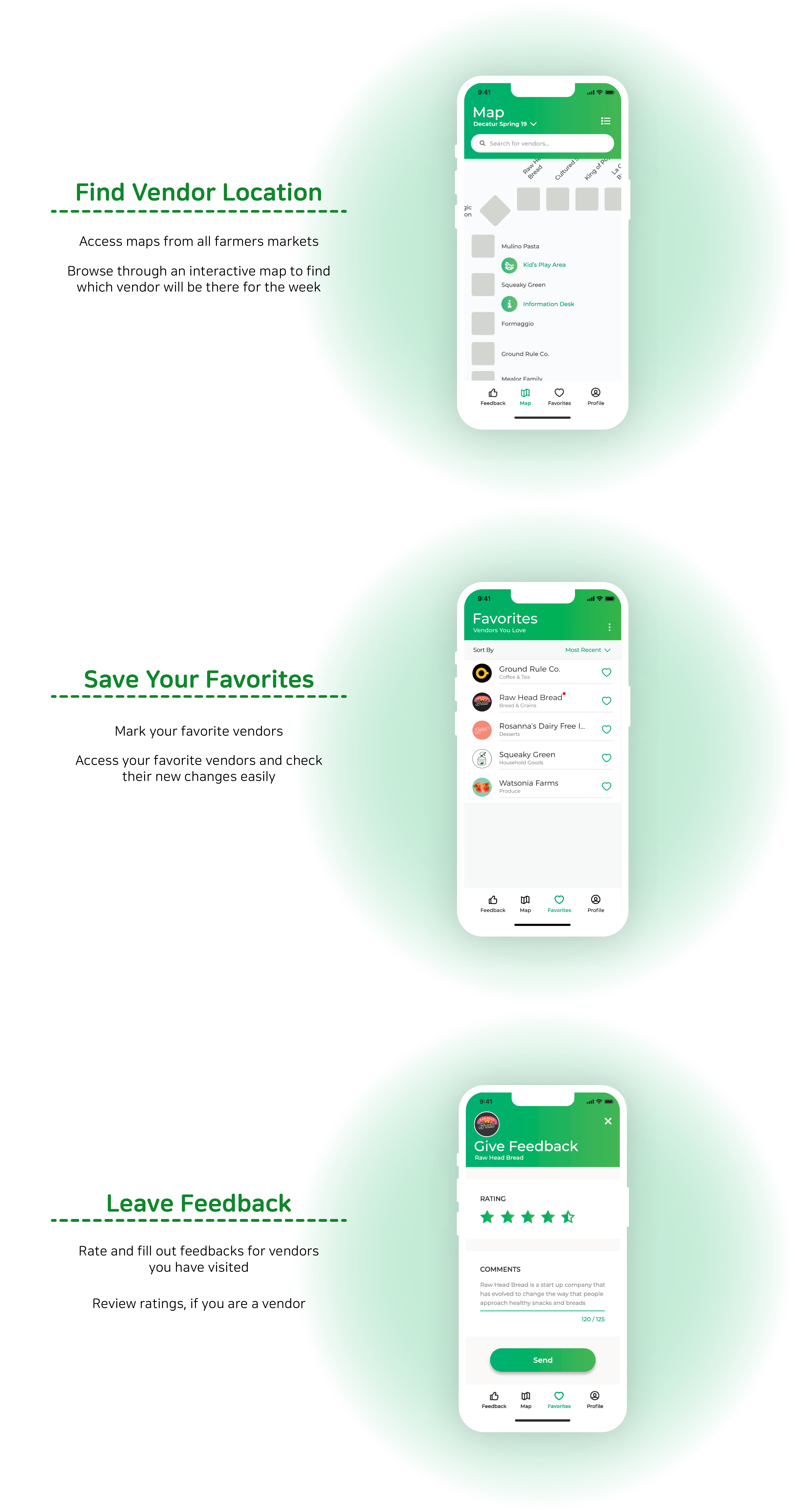
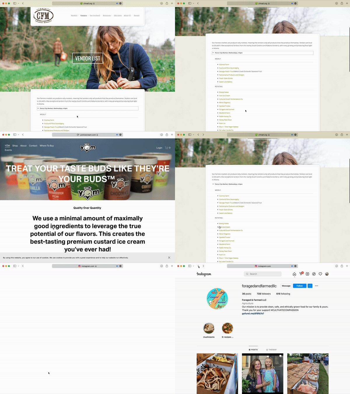
The current CFM website has a list of vendors for each farmers market location. The hyperlinks on the names lead to the vendor’s main use of promotion which include, but not limited to, facebook, instagram, personal website, and google business listing.
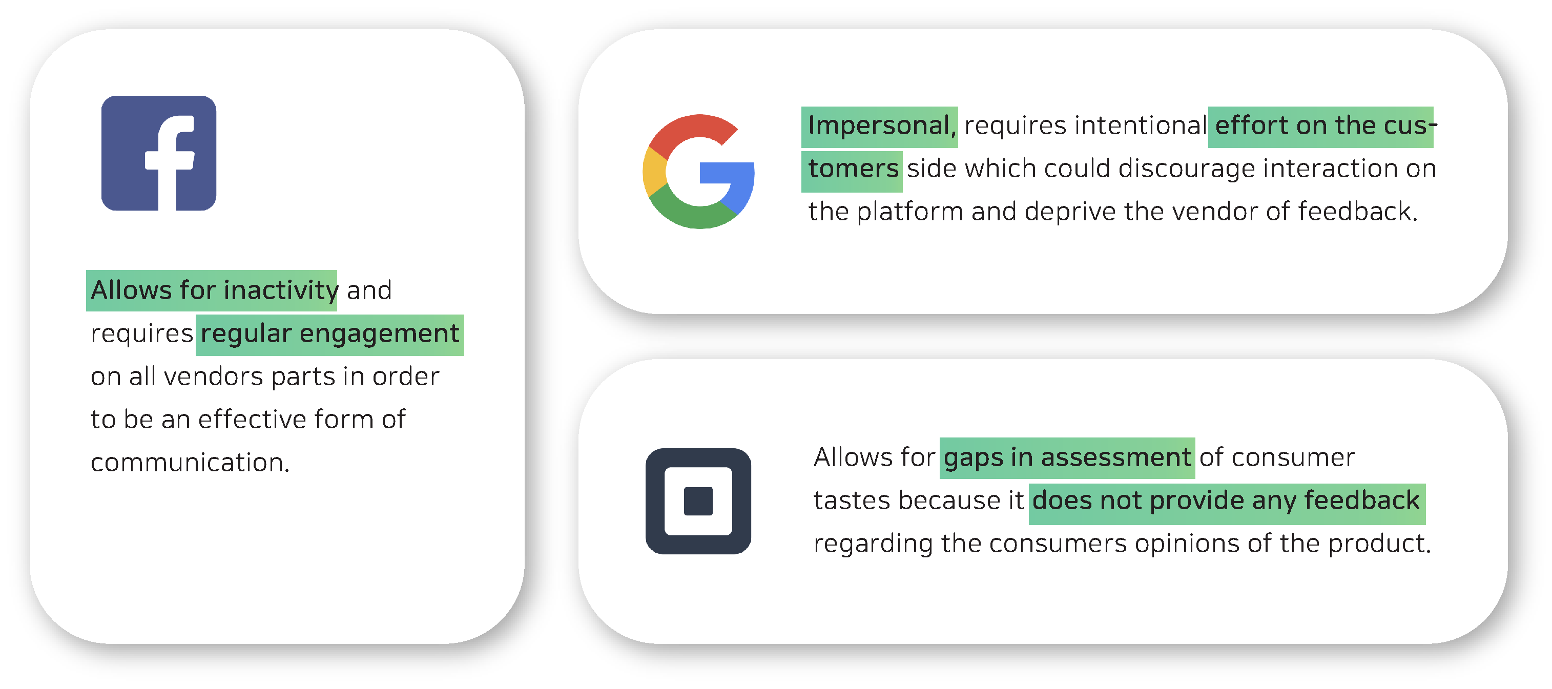
The current methods vendors and consumers of the community farmers market utilize range from simple review systems such as google reviews to social media platforms like facebook and instagram.
Wide range of platforms each vendor use is hard to keep up on the consumer-side. This method also discourages new customers to get involved.
Our group visited a local farmers market in the Greater Atlanta Area to talk to vendors and customers who regularly find the market.
Vendors
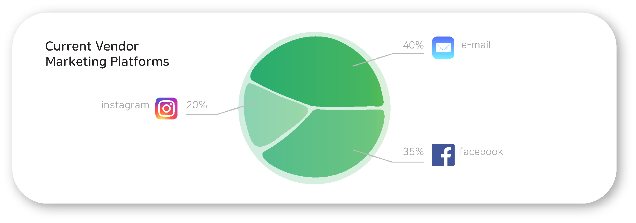
About 40% of vendors did not have any social media accounts
and were handing out their contact information(i.e. website, email, and phone number)
through business cards.
More than half of vendors who do have social media
did not have an instagram account and were using facebook pages.
Consumers
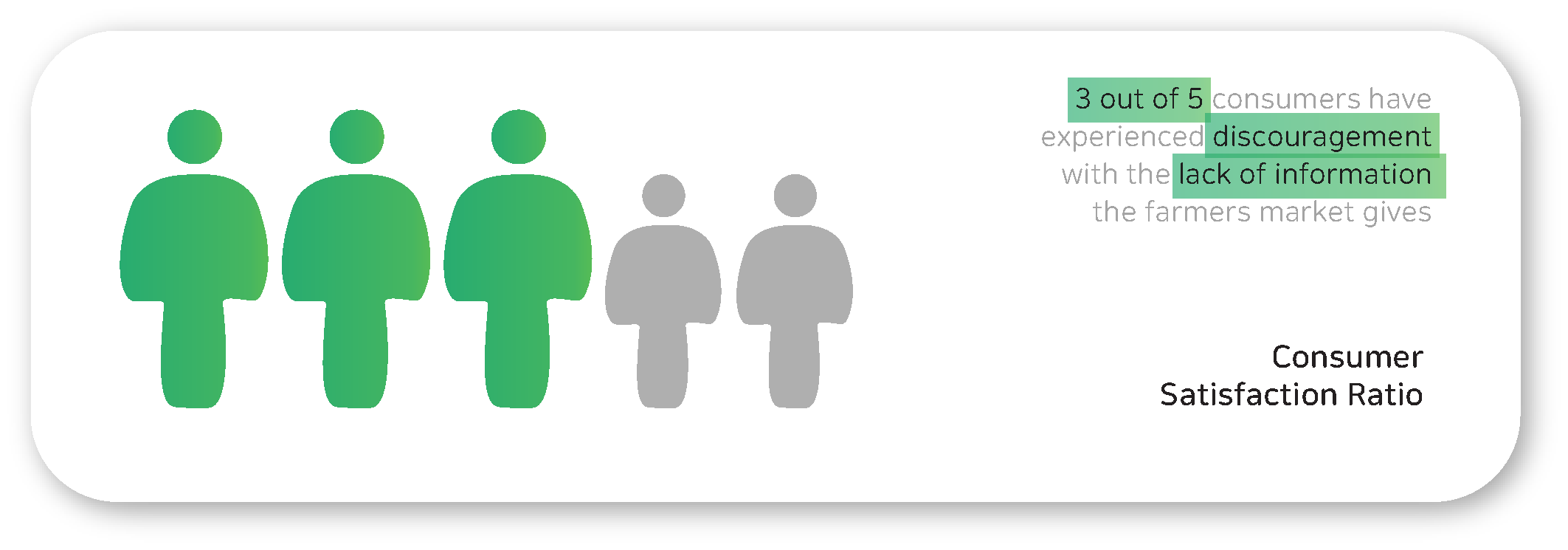
3 out of 5 customers had incidences where they came to the farmers market to find out
that the vendor they were looking for were not there that day.
Most consumers felt like they were disconnected from the farmers market and came by to just “eye shop” for most of the time.
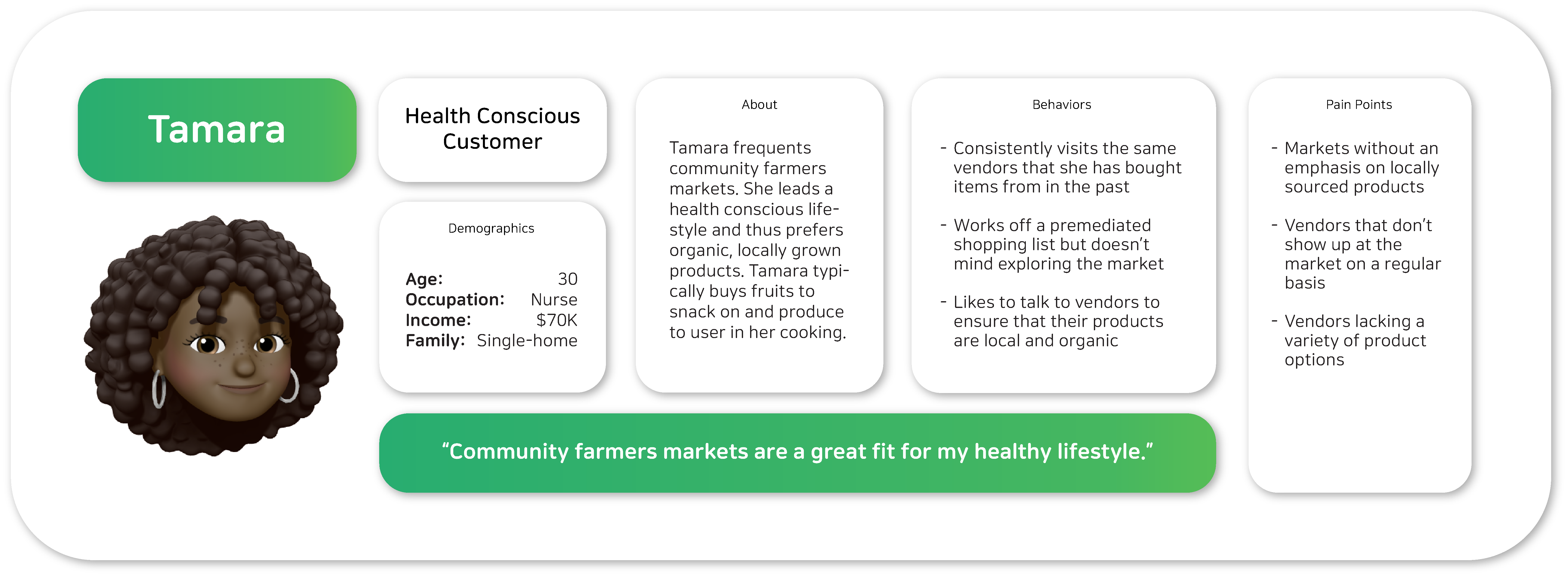
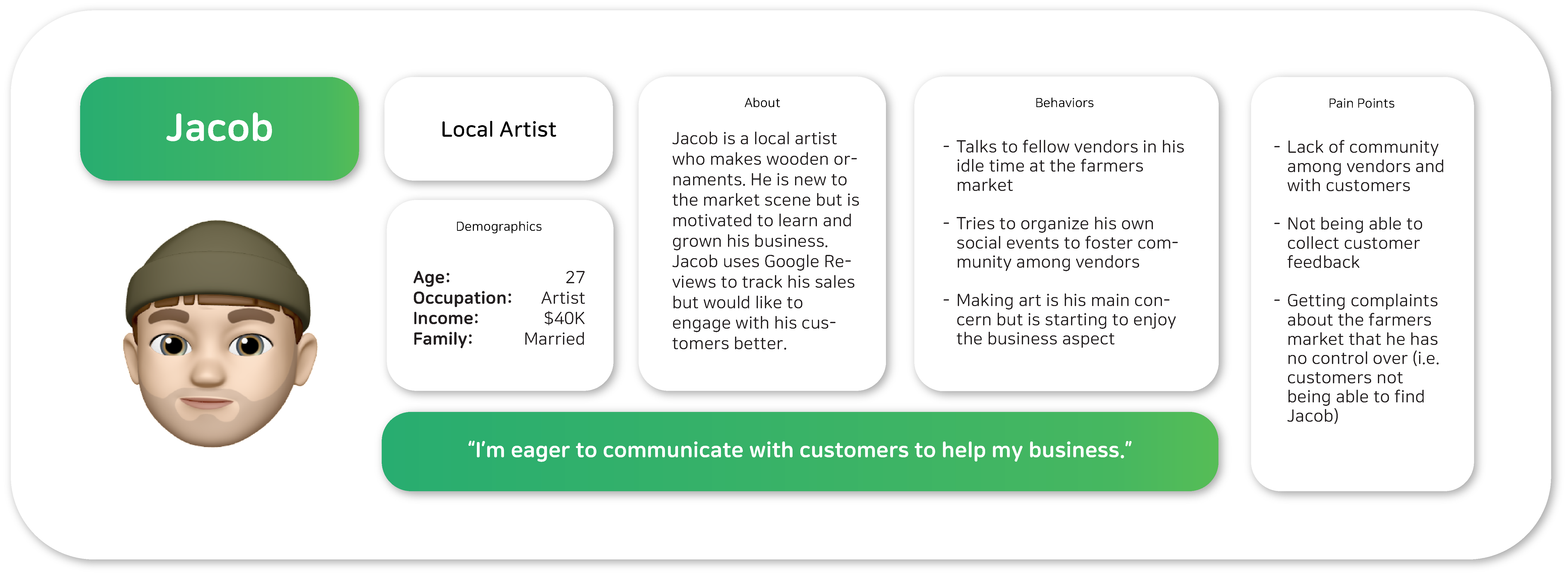
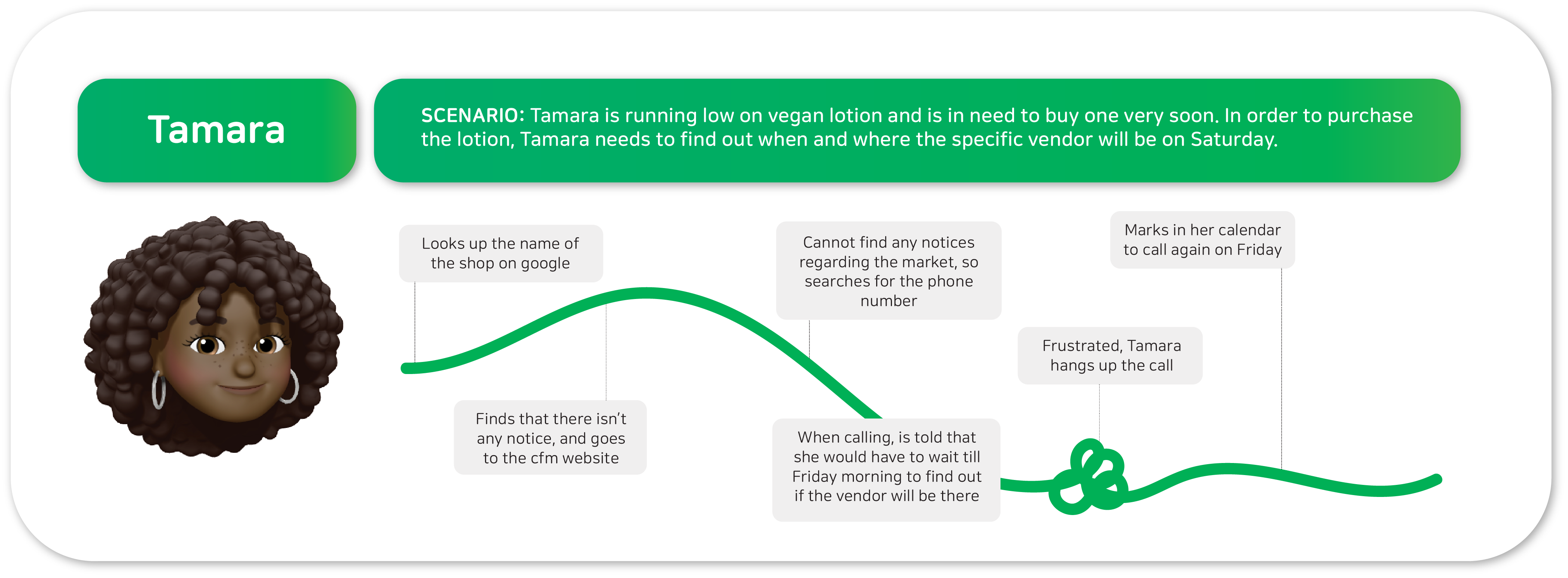
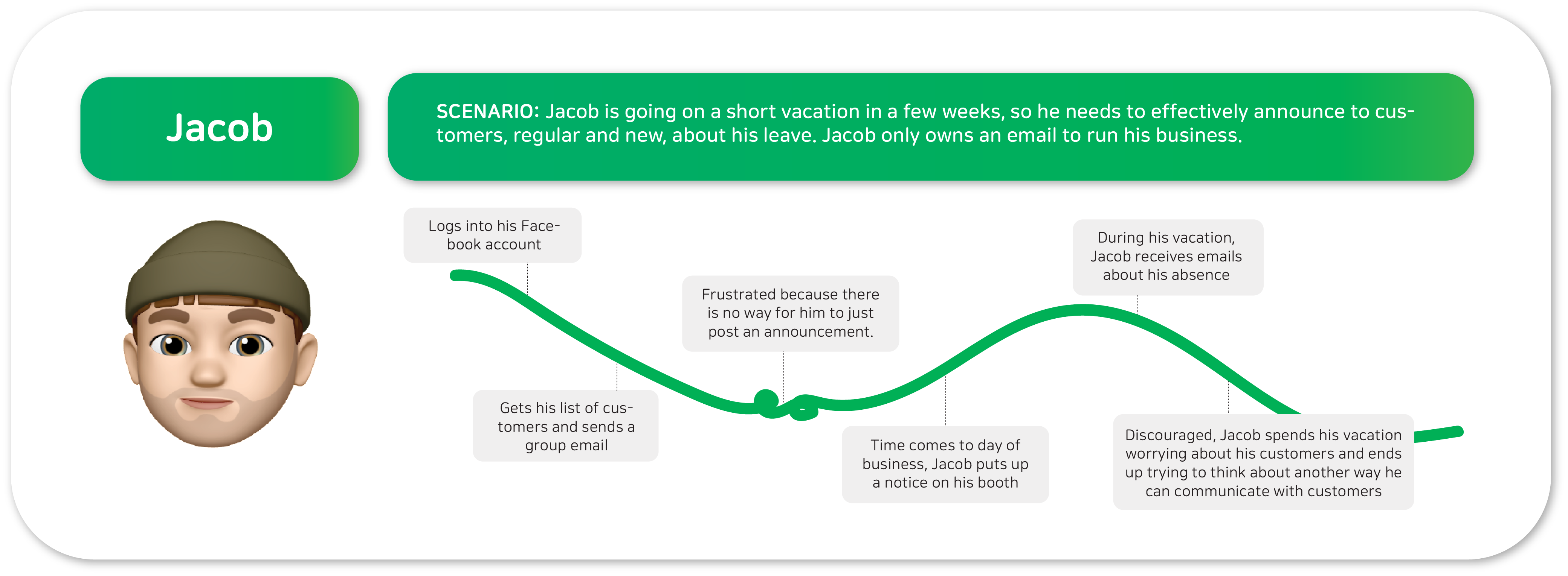
The biggest reason the communication between vendors and consumers lacked was because of the lack and dispersion of information given to the consumers.
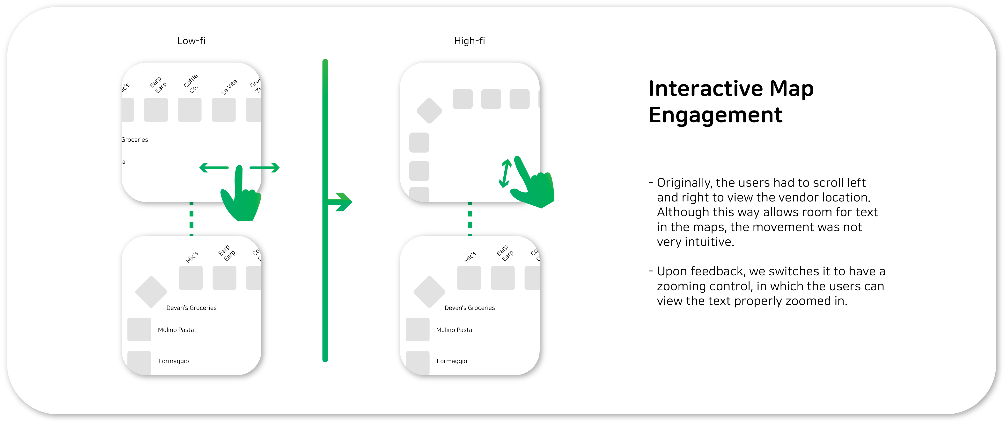
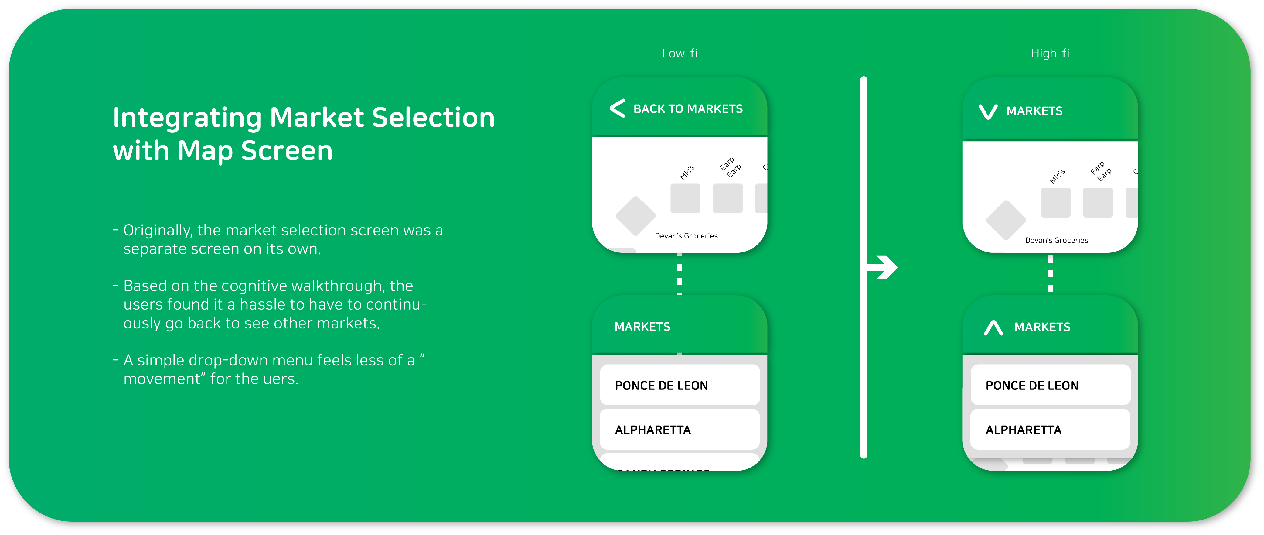
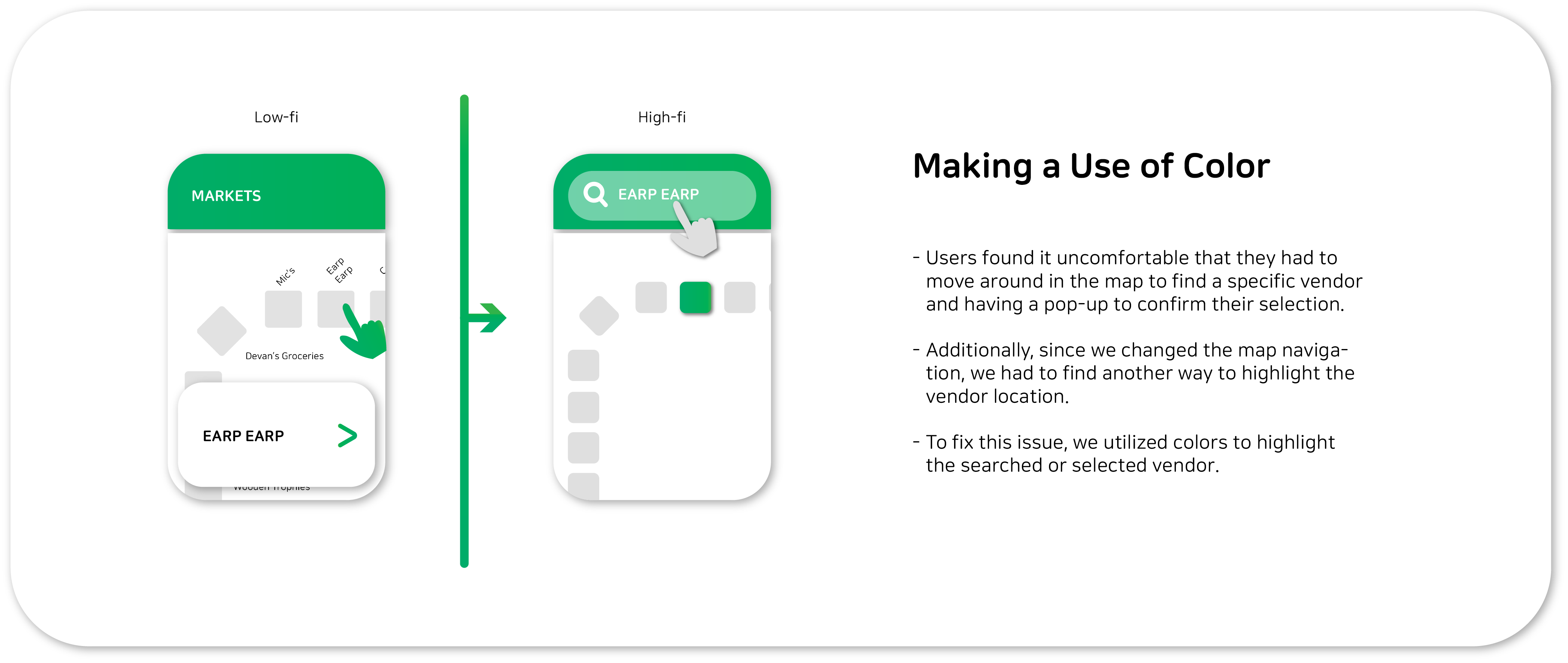
Based on a cognitive walkthrough, we iterated on the low-fi design with three major improvements.
Ask the right questions!
A big part of our research was to talk to people at the farmers market.
While we initially asked questions that required short answers such as,
“do you get cfm information through instagram?” but we quickly realized
that interviewees revealed more of their opinions when we used words like,
“how..”, “tell me about..”, or “if you were to be in … position..”.
Encouraging the interviewees to think about experiences they had or
giving space for them to be imaginative gave us a lot more useful information.
Never assume users will just “get it”.
When it came to the cognitive walkthrough and we first tested out our initial design,
we noticed that a lot of navigations we assumed were intuitive were actually not
very intuitive. To solve this issue, we sat down to think about how we navigate
through other daily applications we use. Having this time allowed us to engrave
in our hearts the importance of detail and flow in simple navigation.